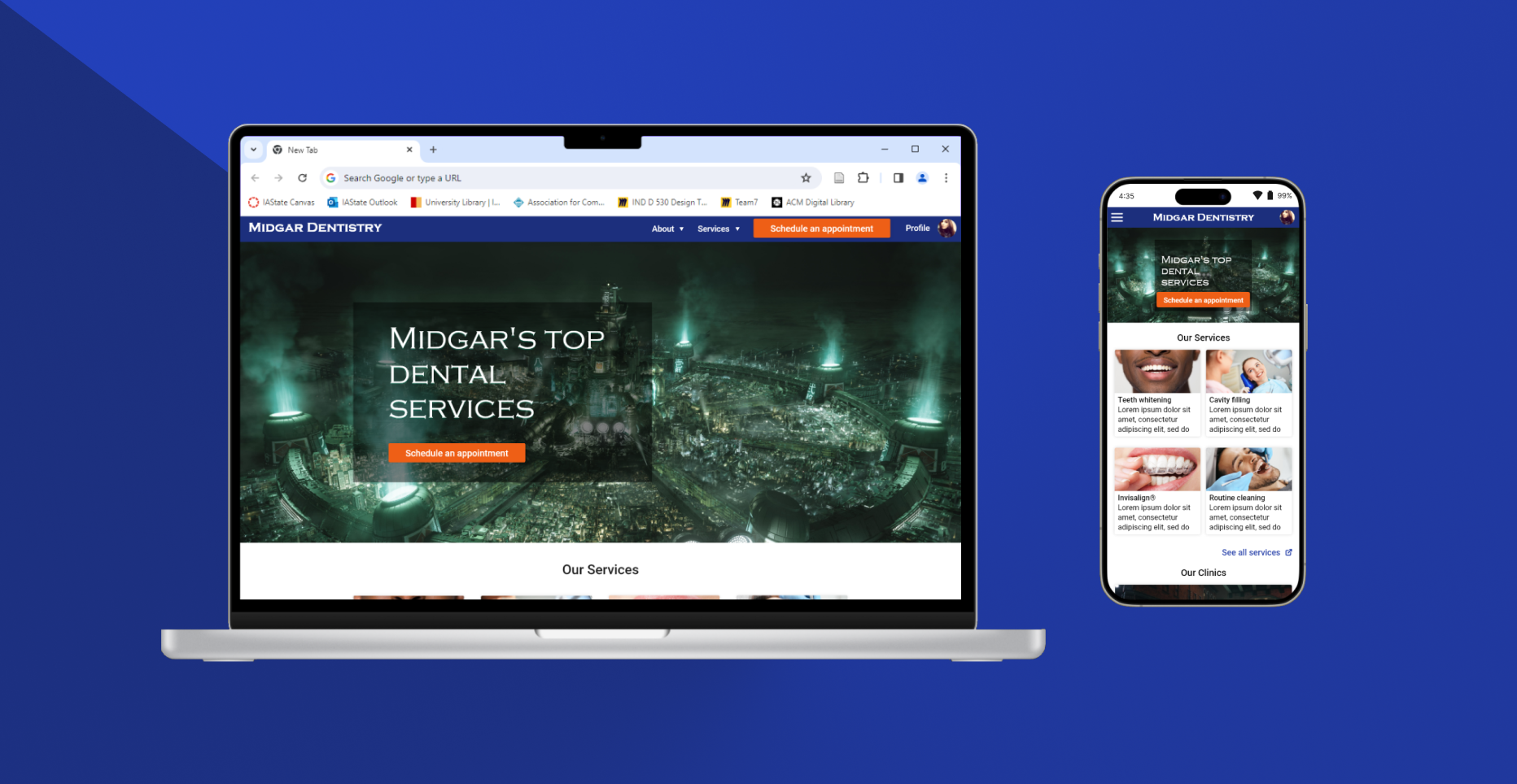
Dentist scheduling platform
Responsive Web Design | 5 minute read

The goal of this project was to create a responsive website design for a fictional dentist collective. This project was a major deliverable for my enrollment in Google's UX Design Certificate program; however, this was strictly focused on UI design and didn't engage the UX Design process.
A major feature of the design is the scheduling platform. After completing a brief competitive analysis, I discovered that many similar websites use third-party platforms for scheduling purposes that reroute the user to a new site with no clear way of going back. I also found that similar platforms didn't offer enough search cases when scheduling an appointment: for example, a scheduling wizard might force the user to start the query process with a time and date and then select a location, rather than giving the option to start searching by location. Finally, the smaller sites were loaded with accessibility and navigation issues, particularly color contrast and scaling issues for the former and multi-level navigation menus for the latter.
Therefore, it was important that my design met the following criteria:
- Appointment search supports multiple entry points. At the start of the scheduling process, users are given the option to begin their search by 4 different verticals: search by provider, location, date, or service.
- Clear and redundant navigation. Though the scheduling wizard follows a sequential UI design pattern, users have multiple ways of returning to the last page, returning home, or starting the scheduling process over again. (In the actual site, I would use modal warnings when abandoning a partial query)
- One interface for all needs. While most competitors use reroutes and third-party systems for scheduling and billing services, my design does everything on one website, which would reduce confusion when users' navigation expectations break their mental models constructed from the initial website experience.
- Accessible by design. I consulted WCAG standards and used tools such as WebAIM's contrast checker to improve the overall accessibility of the interface.
Following the competitive analysis, I created a brief sitemap in Miro to begin structuring the information architecture:

Beginning the design process
I began by sketching some pages on paper following a desktop-first design approach. While some might ostracize me for opting out of mobile-first, I had my reasons:
- I wanted to be able to maximize the amount of information on various features, such as provider detail cards, before deciding how to rearrange or hide information on smaller devices.
- Scheduling an appointment, to me, seems like a desktop activity. When presented with many options (for example, many providers), I believe that users would prefer a larger screen size for easier comparison. (I recognize this could also be untrue, and that beginning this process with UX research might have refuted this theory)
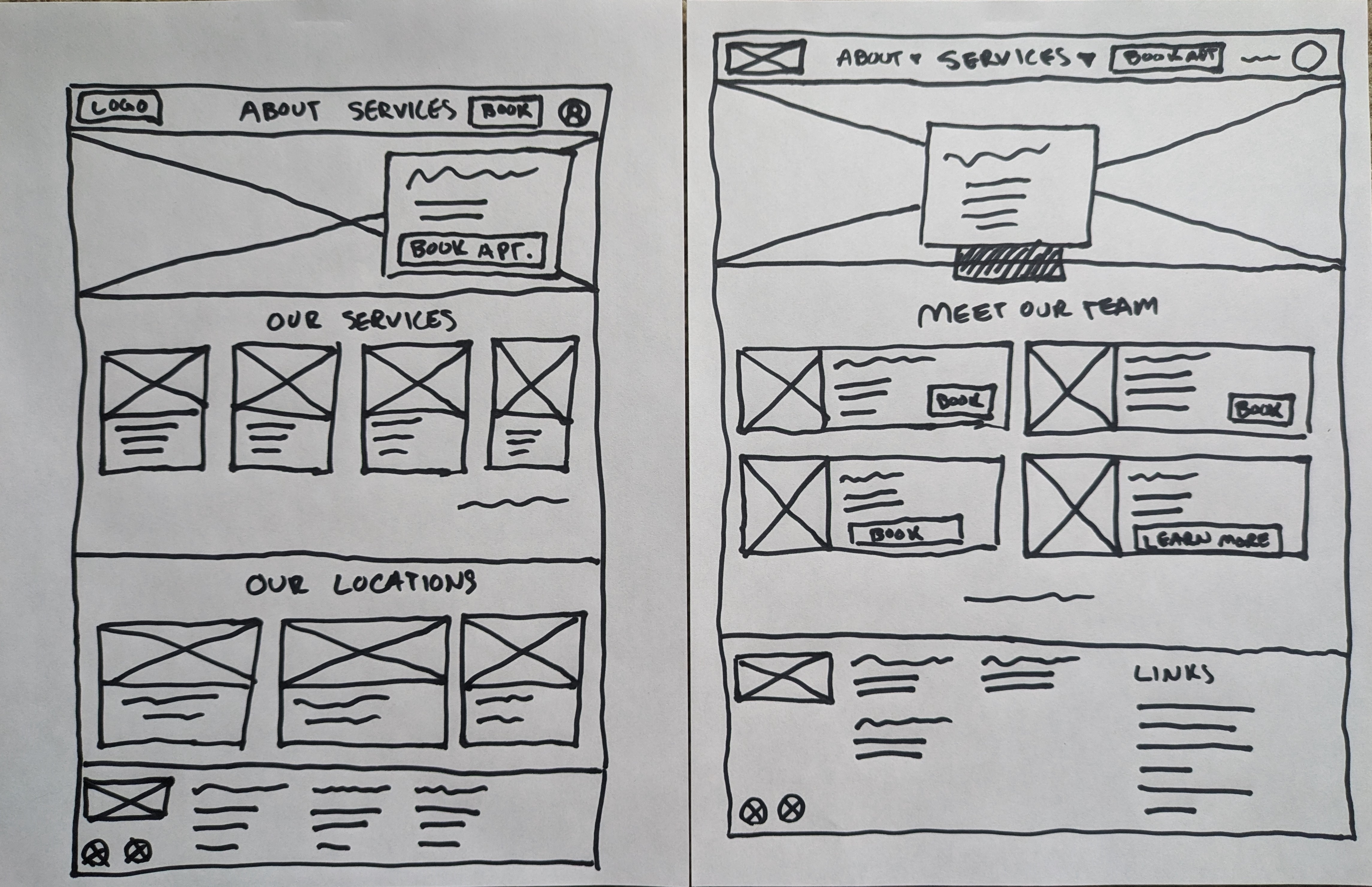
At any rate, I sketched some options on paper for a few key pages, inspired by various design trends. Here's a small sample of early sketches of the home page:

I always struggle with placing text over a hero image
Prototyping
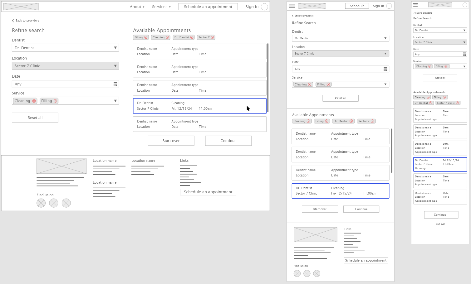
From here, I began creating digital wireframes using Adobe XD. I began first with the desktop version supporting one user flow: scheduling an appointment by provider. I then created a tablet version of the design and finished with a mobile version. Here's a comparison of one screen across all three device sizes:

I ended up regretting the double scrolling under "Available Appointments" and fixed it in the high fidelity prototype
Next, I created interactive prototypes for my mockups. The purpose of this exercise was to force myself to think through the redundancy of the navigation, which was a major goal of mine when starting this project. In wiring screens together, I found a few areas where I needed to add a "Back to last screen" or "Start over" button that I would have otherwise missed.
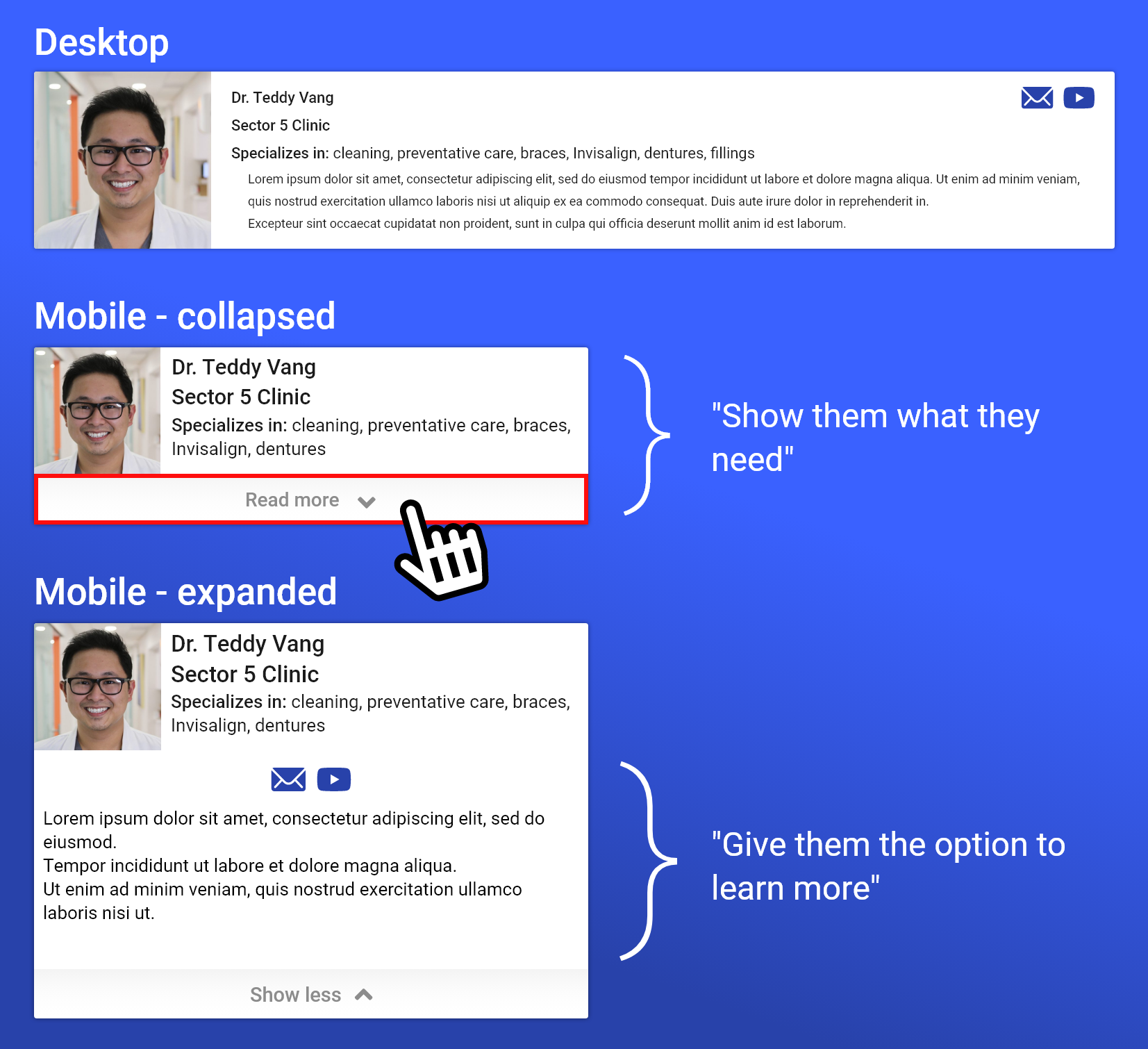
Finally, I completed the prototype by creating hifi mockups (sans specific language: Lorem Ipsum sufficed in this case) beginning with the desktop version and finishing with the mobile version. Figuring out how to simplify and condense information-heavy features was a challenge, but I relied on design elements such as "Show more" buttons to get through it. For example, on the desktop version of the providers list page, there's a lot of details for each provider in the list that would have taken up the entire screen on a mobile device. My philosophy here is "show them (the users) what they need, then give them the option to learn more," which required some reflection on understanding which details are most important for making an informed decision.

Digital wireframes can be accessed here:
And high fidelity mockups can be accessed here:
Retrospective
As a UI design exercise, user research was skipped. Therefore, designing and conducting a usability study would be the natural next step. With other search/filtering use cases modeled out, it would be interesting to see how folks search for information, which would in turn highlight new opportunities for improvement.
I think I achieved my goal with this project: sharpening my responsive design skills. This project made my think critically about the information architecture of a scheduling platform including all things from navigation to hierarchical structuring. I also had the opportunity to imagine the various ways different types of users might prefer to schedule appointments. Finally, and most challenging of all, this project afforded me some great practice in scaling UI elements to the right screen size. It's not perfect—text seems a bit too large in some places, for example—but that's what practice is for!